What's wrong with Google (it seems a bit blue)
I started noticing something earlier today and was worried I was loosing my mind (which I probably am), but I have come across site that confirm my suspicions that Google has changed their icon.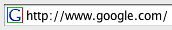
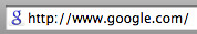
It's a shock. I don't really know how to take it.
I don't like it. It is to small to be able to see clearly, and more cursive than any logo they've had thus far.
The end.
0 comments:
Post a Comment